Attributes & Benefits
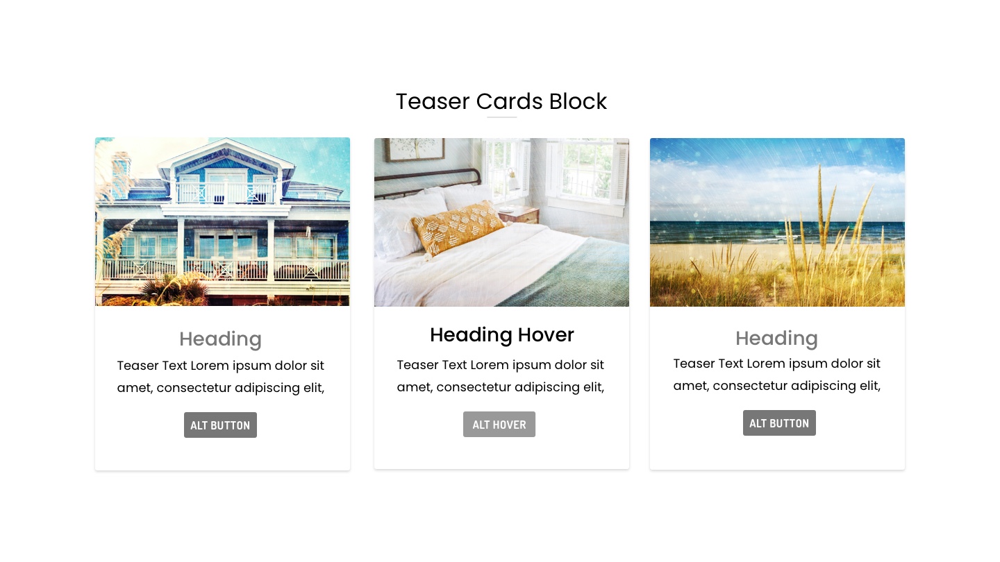
The Teaser Cards Block combines style, functionality, and flexibility to make your website stand out. Ideal for showcasing services, products, ideas, or announcements, this block helps drive traffic to other pages on your site with optional link functionality. Equipped with a main heading, and message to tie the section together, add up to three cards per row. Each card has an image, heading, message, and optional button.
Highlight your content with customizable image settings, perfect for square, horizontal, or vertical images. Effortlessly match your website’s aesthetic with customizable background colors, allowing you to break up sections with a pop of color. The responsive design ensures cards stack neatly on mobile devices, making your site look polished on any screen size. With adjustable padding settings, you can create a well-spaced design for both desktop and mobile views.